
After three and a half years of unbridled and myopic media coverage of a single disease, coupled with unprecedented availability of data on that disease, it is appropriate to ask if any world-wide patterns of interest have surfaced concerning Covid mortality. Unfortunately, the term ‘Covid mortality’ must be used with caution on account of the numerous problems with the publicly available data. A few of the more notable problems are:
- Different countries used different laboratory protocols for determining Covid cases.[1] It is not clear how this affected official numbers.
- What constituted a ‘Covid’ death varied by country and even within countries.[2] The effect of this is also uncertain.
- The PCR test commonly used for determining Covid cases is not capable of establishing whether or not a person is actually infected with a virus, but it is capable of giving false positives.[3, 4] How often and to what extent this influenced Covid data is unknown.
- It is not at all certain how often Covid was the causal agent of death in those so labelled.
- Some countries performed mass testing of their populations while other countries did not.[5] How this contributed to the numbers in the data is enigmatic.
- The percentage of Covid cases that were sequenced in a laboratory varied drastically between countries, and over time.[6] Whether or not this caused differences in the accuracy of the data from one state to the next is unknown.
Furthermore, it is worth mentioning that previous to the Covid-era mortality data usually took a year or two to be processed and published. No sooner had Covid garnered international attention, however, than there was an astonishing change, such that data was suddenly published almost in real time. As recently as 2019, the CDC admitted that “there is a trade-off between timeliness and accuracy of… estimates.” And, “testing data are often not available for up to two years after the end of an influenza season.” [7] Since it is unclear how this sudden improvement was accomplished during the Covid era, it is also unclear how accurate the data surrounding Covid mortality actually is.
Naturally, the net result of all of these factors (let alone other factors that we have neither discerned nor mentioned) working together and at the same time, is that Covid mortality data must be considered dubious at best. Also, any conclusions arising from comparisons between countries or regions should be taken with a grain of salt, and possibly even viewed as either sketchy or meaningless.
Notwithstanding how difficult it is to establish how many deaths were caused by Covid, let alone how the SARS-CoV-2 virus factored into those deaths, the term ‘Covid mortality’ might still mean something, for it is almost certain that most deaths attributed to Covid do indeed correspond to a particular individual who died somewhere, for some reason, to the sorrow of friends and family. It is also likely that there were world-wide trends in the way the data was handled and processed. For this reason, and for the purpose of this article, we here define ‘Covid mortality’ strictly as ‘official published tallies of deaths attributed to Covid’. The goal here is to determine if anything can be learned from the (flawed) data surrounding ‘Covid mortality’.
To accomplish this, we begin by taking a close look at two neighbouring mid-western states within the USA. From there we will expand outward to consider a cluster of five neighbouring states. After this we will again broaden our view, this time to examine all the states in the USA. Next we will add Canada into the mix; and, finally, we will consider the world at large. To make the subject matter more manageable, we have chosen to publish our work in two parts. This first article will focus solely on the USA.
Two neighbouring states
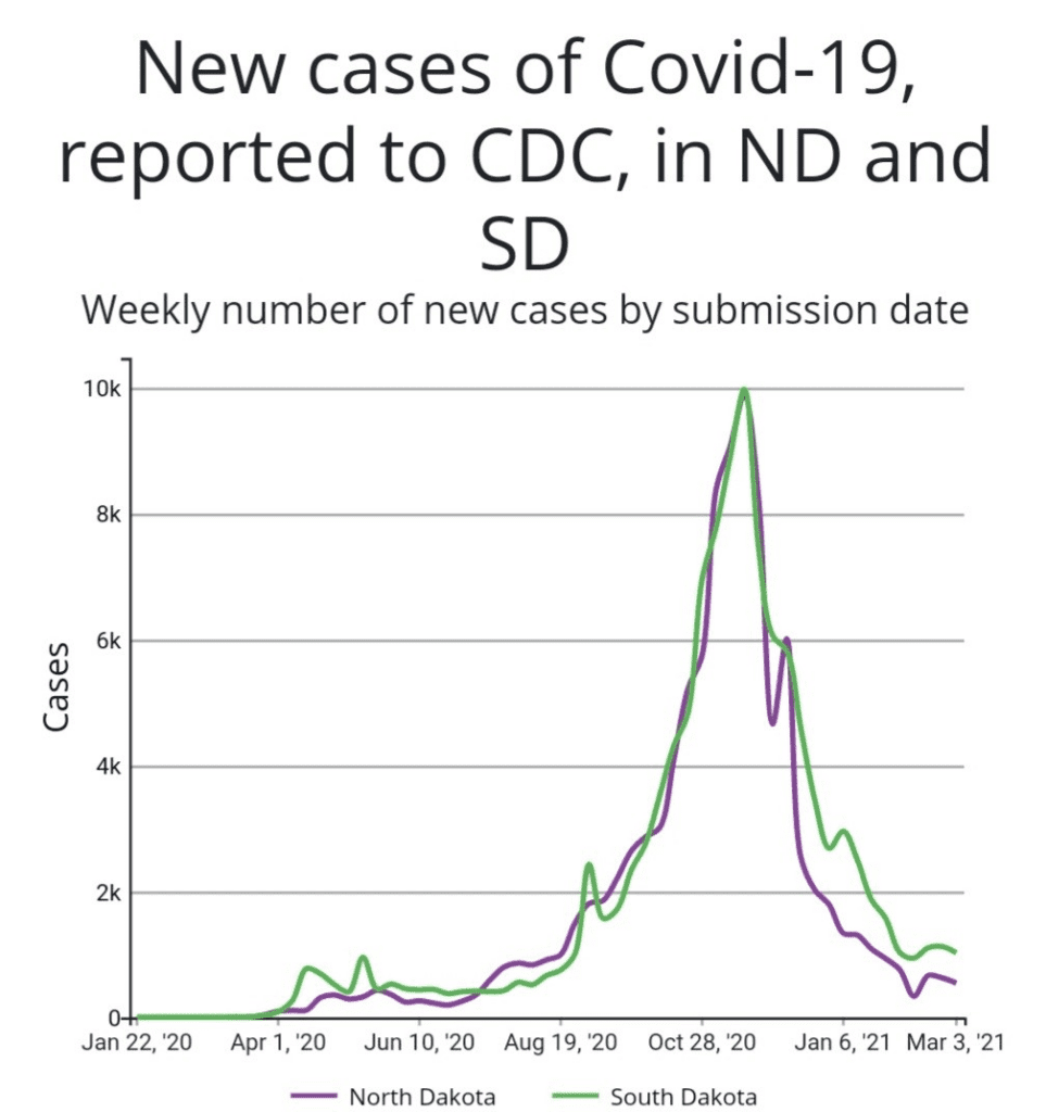
Many studies have been undertaken to examine how successful lockdowns were at curtailing ‘Covid mortality.’ The general consensus of the articles we have encountered is that lockdowns had no discernible influence on the trajectory of Covid.[8] In a previous article,[9] we demonstrated this visually with a graph that plotted Covid cases in two mid-western states, namely North and South Dakota. We chose these two states because they are adjacent to each other, enjoy relatively similar climates, have comparable population densities, and, significantly, took divergent paths in responding to Covid. North Dakota chose to lock down somewhat, while South Dakota opted for no lockdowns at all. Despite what some might have expected, the curves were almost identical for the two states.
The above graph, however, only covered the first year of the Covid-era. It is appropriate, therefore, to ask how these two states fared in the following years. This is an especially relevant question since matters affecting health frequently take years to surface. If we include the first three and a half years of data, and plot cumulative Covid deaths instead of new cases, the graph still shows remarkable parallels between these neighbouring states, as shown below.
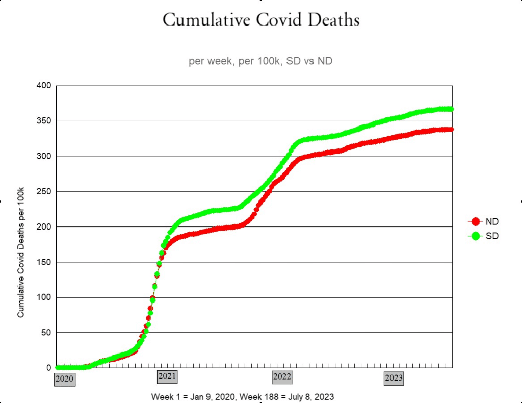
From this graph (Figure 2) we see that, beginning at about the time that the Covid shots were rolled out to the public, South Dakota took a slight turn for the worse relative to its northern cousin. Were the Covid shots the driving force behind this shift in trends? Based on the foregoing graphs, we might be inclined to think that since South Dakota opted to avoid lockdowns, the residents might also have chosen to avoid getting the jabs and so had more Covid deaths. Actually, the opposite happened, as may be seen from the next graph.
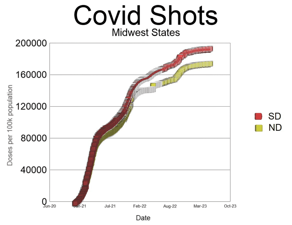
Although South Dakota did not lock down at all, the people were more willing to roll up their sleeves and get the jab than were those to the north. Despite the extra doses, however, South Dakota reported a higher rate of Covid deaths. Does this mean that the extra shots made Covid worse in South Dakota? We can test this hypothesis by bringing a few other mid-western states into the comparison, to see if the same sort of trends happened there as well. We begin by adding Minnesota.

In Figure 4 we see that except for the first few months Minnesota had lower rates of Covid deaths than either North or South Dakota. If, in fact, higher vaccine uptake resulted in increased Covid deaths, we should expect that Minnesota (which had the lowest Covid deaths per capita of the three) should also have had the lowest vaccine uptake of these three states. Again, the opposite happened.
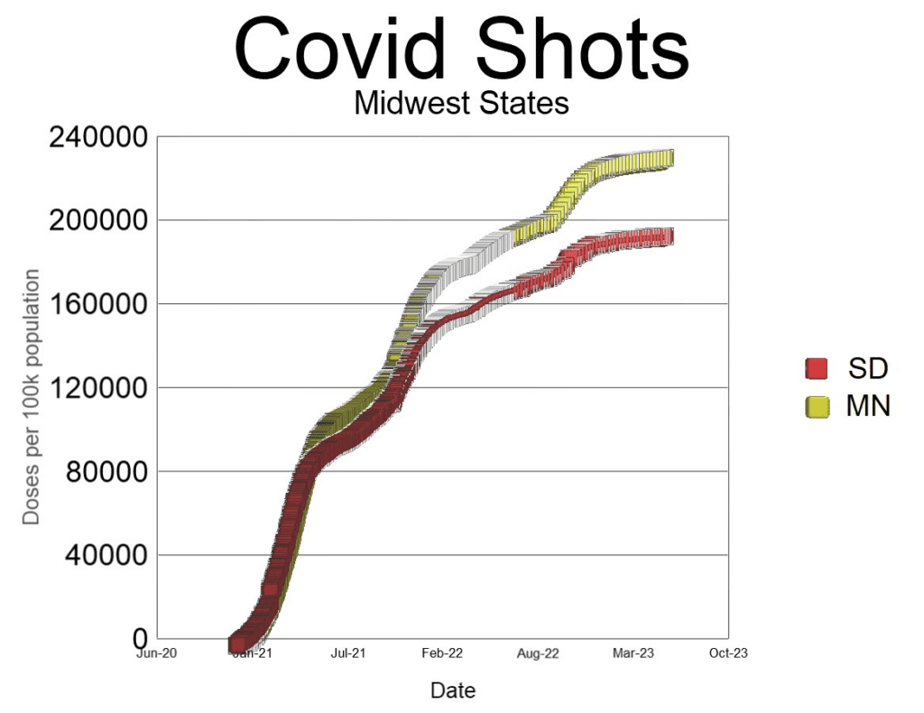
More Minnesotans were jabbed, and yet fewer died of Covid than in South Dakota. We are forced to conclude, therefore, that the idea that more Covid shots drove increasing numbers of Covid deaths in South Dakota relative to North Dakota was an overly simplistic assertion. It does not even reflect what happened in three states. We could carry on adding states into the mix, comparing population density, vaccine uptake, stringency of lockdown measures, and so forth, but all we would find is that there appears to be no simple correlation between these variables.
Why all the confusion? Is it possible that despite all the fanfare, cost and expense, lockdowns and vaccines did not play a decisive role in determining Covid outcomes? We would be hasty to jump to such a conclusion based on this limited study, of course, except for the fact that multiple researchers have come to these exact conclusions: lockdowns did not noticeably change the trajectory of the virus.[9] Neither did the Covid shots prevent transmission or death.[10] Nonetheless, it is probably best for the moment to conclude that it is not possible to use a comparison between states to establish whether or not lockdowns and Covid shots decreased Covid deaths. Such a conclusion is unexpected.
So the question now before us is, how do we account for the variations in Covid death rates between different states in America? Is it even possible to find an explanation? This question is certainly not new. Shortly after governments and news outlets began flooding the internet, airwaves and newspapers with daily dashboards of Covid cases and deaths, even casual observers began to notice differences in the case rates between different countries, regions, states, and provinces. These differences were noticed because they were significant. Not surprisingly, they posed a challenge that epidemiologists found difficult to explain. [11, 12] They also caused a lot of speculation, as in the debate over whether or not Sweden did the right thing by refusing to lock down their country.
Five neighbouring states in the American Midwest
It is important when seeking to compare mortality rates that the regions being compared share similar characteristics. For example, a state with an older population such as Maine, with a median age of 45, will have a higher all-cause mortality rate than a younger state such as Utah, with a median age of only 32. [13] When comparing mortality rates between states, therefore, age-adjusted mortality rates are sometimes used. However, since we are seeking to explore differences in Covid mortality between states, it might be better for our purposes to use crude mortality rates (CMR).
Crude mortality is defined as the total deaths in a specified location divided by the total population. For ease of presentation, we calculate CMR per 100,000 people in the population as follows:
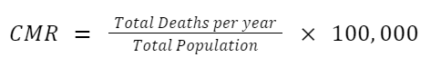
Crude mortality encompasses every death in a region, which means that it functionally takes into account every possible aspect of mortality, including the median age, general health, availability of health care, and prevalence of disabilities. It would even include how dangerous the roads generally are or how reckless the average driver is, although it would be difficult to tease such a minor factor out of the data.
In order to compare Covid deaths with crude mortality rates, we define CCD as the cumulative Covid deaths in a particular region per 100,000 people, averaged per year:

The denominator 3.5 accounts for the fact that the data used to calculate total Covid deaths spanned a window of 3.5 years (1 January 2020 to 30 June 2023). Thus, CCD is a yearly average of deaths due to Covid, in the same way that CMR is a yearly average of all deaths. Below we plot the CMR in 2019 alongside the CCD for five midwestern states (Minnesota, Nebraska, North and South Dakota, and Iowa).

The first thing that stands out is that despite all the attention given to Covid, it represents only a small fraction of total deaths in a normal year. A second notable fact is that there is an almost 20% increase in CMR between Minnesota and Iowa. Third, there seems to be something of a trend, such that the higher the CMR was in 2019 for a particular state, the higher the published Covid deaths were during the Covid-era in that same region.
All states in the USA
To test if there really was a trend between CMR and CCD, we made a scatter-graph of all 50 states plus DC. The results are shown below:
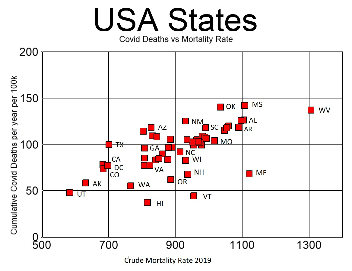
As can be seen in Figure 7, there is a noticeable trend of increasing CCD with increasing CMR. Furthermore, it is also observed that there are six states that distinctly fall below what appears to be the norm for the other states. These six states (Hawaii, Washington, Oregon, New Hampshire, Vermont and Maine) somewhat obscure the trend. Interestingly, five of these six states are found in the extreme northern corners of continental USA. The sixth is an island in the Pacific. This unexpected trend suggests that there may be an association between Covid deaths and geography. To test this hypothesis, we plotted the data again, this time colour-coding states according to the Health & Human Services (HHS) region to which they belong. A map of the ten HHS regions in the United States is shown below.
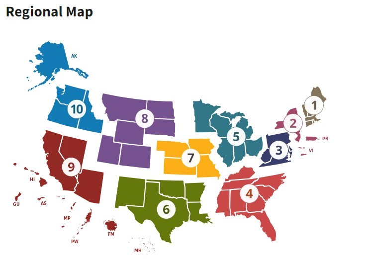
Figure 8: Map of the USA showing ten HHS regions
The new colour-coded graph is shown below.
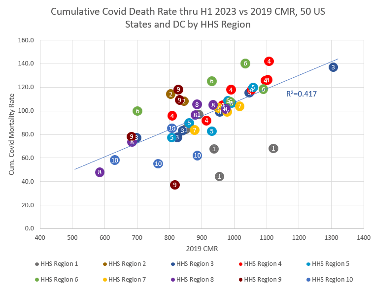
Figure 9 reveals a few patterns worth mentioning. HHS regions 2, 6 and 9 were typically high, while HHS regions 1 and 10 were typically low. States in any given HHS region tend to follow the same upward trend. To demonstrate this further, we plotted the data yet again, this time removing Hawaii and also HHS regions 1 and 10 from the graph. Of course, there are hazards involved in removing data from a scatter plot, not least of which is the potential to bias one’s conclusions. However, it is justified here on two grounds: first, we are not randomly removing outliers to force a correlation where there is none; and second, we are attempting to eliminate the influence of the observed geographical anomaly from the picture. We freely admit that the reasons for the anomaly are unclear.

The 40 states included in the above graph show a remarkable linear relationship between CCD and CMR, with a R-squared value of 67% (high fit) for the regression line. The following observations are noted:
- CCD varied almost three-fold between states, from a low of 48 (Utah) to a high of 142 (Mississippi), revealing a massive difference in how many deaths per capita in a particular state were attributed to Covid.
- Despite this significant difference in Covid deaths, there was a consistent and strong linear relationship between total Covid deaths and the 2019 crude mortality rate.
- According to the best-fit line, CCD started at about 11% of CMR and ended at 11.2%. The increase is minor, however, and may be nothing more than statistical noise
From these observations, and bearing in mind that we removed a few outliers, the following conclusions are suggested:
- It is inconceivable that mortality rates in 2019 caused Covid deaths in the following years (2020-2023). People can only die once. Therefore the correlation seen here cannot possibly be a direct causal relationship.
- If there is a relationship between CCD and CMR, it is most likely because whatever influenced how many people died in 2019 also influenced how many were going to be labelled a Covid death in the years after 2019.
- Since Covid deaths align with CMR despite significant differences in lockdown policies, it strongly implies that any effectiveness of the NPIs was completely dwarfed by the correlation with pre-existing mortality rates.
- Likewise, since there were wide differences in vaccine uptake between states, it strongly implies that the effectiveness of the Covid shots, if any, was also dwarfed by pre-existing mortality rates.
- It is not recommended to make any conclusions concerning the effectiveness of NPIs by comparing Covid deaths between states; other methods should be employed and taken into consideration.
- Since Covid death rates are somewhat correlated to HHS regions, it is possible that things particular to each region may have contributed to the variations in Covid death rates. For instance, it may be that health regions in the USA used different testing protocols (different primers in PCR tests, different cycle thresholds), different procedures for defining a Covid death (Covid symptoms required or not, cancer deaths called a Covid death or not, etc), and different treatment protocols in hospitals (ventilator use, early treatments, etc). This is a matter for further study.
- Comparisons between states that are in different HHS regions are subject to unknown factors that should be discovered before any conclusions are asserted.
- It is not clear why the two extreme northern corners of the USA (north-east and north-west) should both be outliers. This is a matter for further study.
- The fact that the ratio of CCD to CMR rises slightly with CMR might suggest that older populations generally fared worse than younger populations.[14]
In order to dig a little deeper into the last suggestion above, and also to see if the correlation between Covid mortality and crude mortality was simply on account of the age profile of each state, we next plotted Covid mortality against median age. The results are shown below.

Figure 11: Cumulative Covid deaths per year per 100,000 people versus median age, by state, plotted for the entire USA. Source
As can be seen from Figure 11, there is no observable correlation between median age and Covid mortality. Rather, there appears to be only random scatter. Regression analysis confirms this, for it gives R2 = 1%, which is extremely low. This result was unexpected, since it is commonly accepted that Covid mortality generally increases with age. One possible explanation for this null result is that so many older people survived the Covid era unscathed that any state-wide correlation between Covid mortality and median age was lost. For comparison purposes, we next plot the crude mortality rate against median age. The graph is as follows:
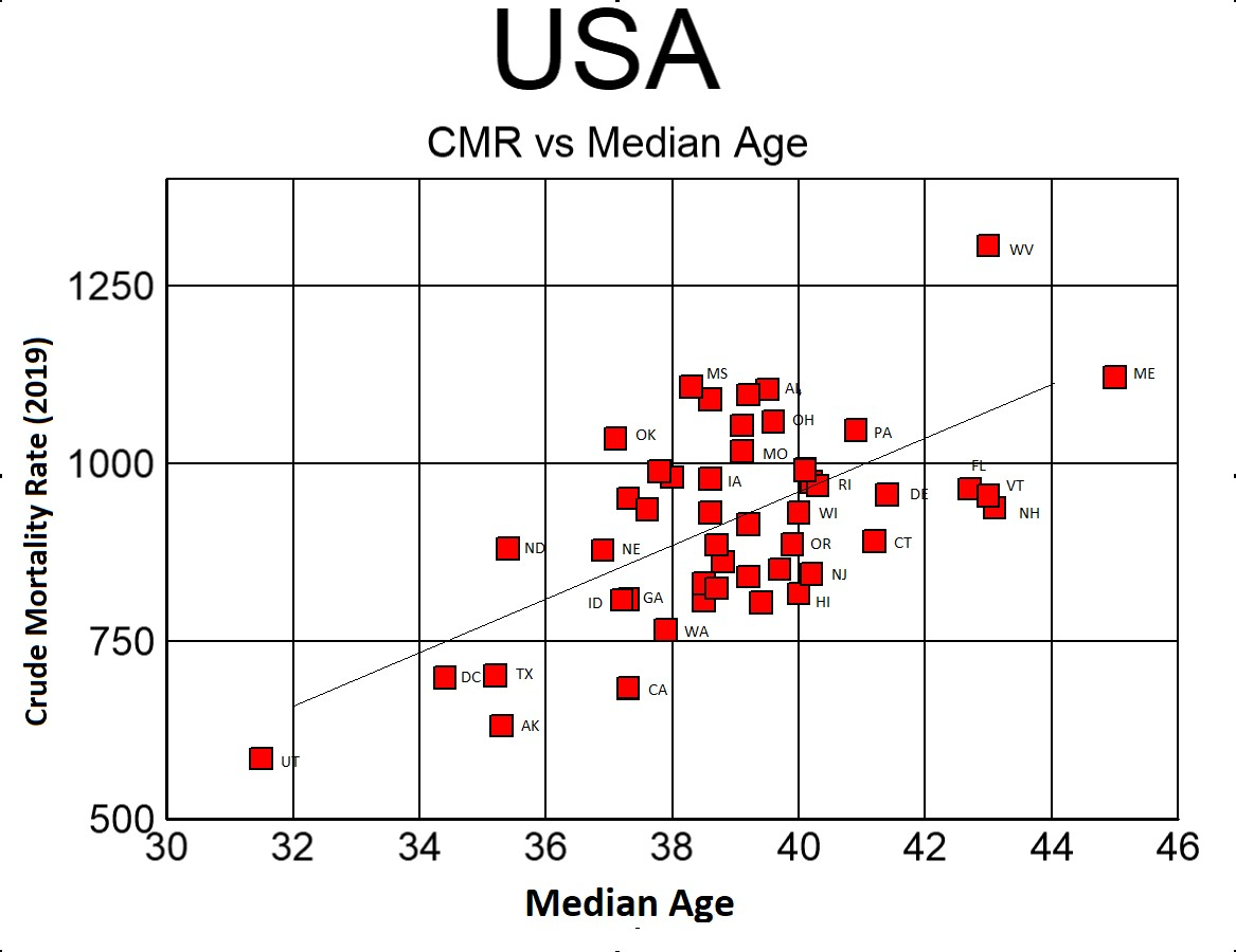
Figure 12: 2019 Crude mortality rate versus median age, by state.
The above graph reveals a medium correlation (R2=38.8%) between CMR and median age. This was expected, since age profile is a strong determinant of crude mortality rates. The fact that Covid mortality is both linearly proportional to CMR and age-dependent, yet shows no correlation with median age is a strong indicator that the relationship between Covid mortality and crude mortality is a matter of significance.
The linear correlation between CCD and CMR indicates that the idea put forth by multiple governments, modellers and media sources in March 2020 that we were faced with a novel deadly virus against which we had no natural immunity or treatments is certainly false. Had Covid killed 1% of the population indiscriminately, as modelled [15], we would not expect to find a strong correlation between Covid deaths and CMR. Instead, Covid deaths would be proportional to the population, meaning that we would see horizontal lines on our graphs of CCD vs CMR. This is especially true since neither lockdowns nor the Covid shots proved to have any observable influence on the trajectory of Covid. [10]
Furthermore, the fact that Covid deaths are so tightly aligned with 2019 crude mortality rates implies that if any state experienced ‘excess deaths’ during the Covid era, all the deaths attributed to Covid (or at least the great majority of them) properly belong in the ‘normal’ category of baseline deaths, rather than in the ‘excess’ category. In other words, any excess deaths in the USA after 2019 were likely caused by things other than Covid. Such a conclusion may startle some people, for it is commonly thought that since ‘Covid’ was a new term in 2020, it must have caused any and all excess deaths. The preceding graphs strongly argue against this notion. If, by way of analogy, the CDC decided to implement a new category for certain types of cancers, would that mean that any excess deaths in subsequent years should be blamed on the new term? Of course not. So also, if 2019 mortality rates determined Covid mortality in 2020 and beyond, it is quite likely that the new term ‘Covid’ was simply being applied to previously existing causes of death.
Adding a new category to the list of causes of death does not cause more people to die. Massive societal interventions, on the other hand, and major disruptions and changes to normal medical protocols most certainly have the potential to affect mortality. For example, vast swaths of society were shut down and large numbers of people were forced out of work. Schools were closed. Hospital protocols were changed. Elective surgeries were cancelled. Masks were required in many localities. The Covid shots were based on a brand new technology never before used in any previous vaccine. The shots were subsequently mass produced, rushed out, and forced on most of the country. In short, so many society-altering changes were made during the Covid era that it is safe to say that everyone in the USA was affected in one way or another. It is almost incredible that anyone would ignore these monumental changes and instead blame the excess deaths on a respiratory virus such as Covid. Indeed, what better way is there of examining how effective all these measures were than by seeing if they resulted in excess deaths?
Someone might ask, is it even possible that all the Covid deaths fit into the normal tally of yearly deaths? It is distinctly possible. As the above graphs testify, Covid mortality was only about 11% of normal deaths in 2019. To be more precise, Covid deaths, as published by the CDC, totalled slightly over one million on 30 June 2023. This gives an effective yearly average fatality rate of 0.096% of the population (1,099,923 deaths ÷ 328,259,523 people ÷ 3.5 years). In 2019, which was a normal year for mortality in the USA, 2.8 million people died in a population of 328 million. Thus, 0.87% (2,854,838 ÷ 328,239,523) of the American population died in 2019. As per the above graphs, Covid mortality amounted to only a small fraction (11%) of the number of normal deaths. Therefore, it is certainly possible for Covid deaths to have formed part of the normal baseline.
Geography
In order to investigate further how geography might have affected Covid mortality, we next plotted CCD versus the latitude of each state. We used the geographical centre of a state to establish the latitude. The results are shown below.

Hawaii is once again an obvious and expected anomaly. The above graph reveals a weak trend (R2 = 26% if Hawaii is excluded) of decreasing Covid mortality with increasing latitude. Since HHS regions only involve contiguous states, the states in each health zone generally occur along vertical trend lines (constant latitude, changing CCD). Of interest is that it is possible that Alaska is not an outlier, despite being significantly north of the rest of the states. The regression line suggests that for every degree one moves northward, there were two fewer Covid deaths per year per 100,000 population.
The idea that even Alaska might fit with the trend of decreasing Covid deaths with increasing latitude naturally led to the inclusion of Canadian data into the picture. However, and as promised, we must break off here to keep the article manageable. We hope to look at Canada in part two.
References
- Anonymous, “WHO Coronavirus In-house Assays,” WHO, 2020, https://www.who.int/docs/default-source/coronaviruse/whoinhouseassays.pdf
- Fritz, Joy, “A Covid Death? The Bureaucracy Decides,” Claremont Institute, https://americanmind.org/salvo/a-covid-death-the-bureaucracy-decides/
- Smith, Jennifer, “PCR Testing Skewed and Corrupted Data on SARS-CoV-2 Infection and Death Rates,” Panda, 2022, https://pandata.org/pcr-testing-skewed-and-corrupted-data-on-sars-cov-2-infection -and-death-rates/
- Braunstein GD, Schwartz L, Hymel P, Fielding J, “False Positive Results with SARS-CoV-2 RT-PCR Tests and How to Evaluate a RT-PCR-Positive Test for the Possibility of a False Positive Result.” J Occup Environ Med. 2021 Mar 1;63(3):e159-e162. doi: 10.1097/JOM.0000000000002138. PMID: 33405498; PMCID: PMC7934325.
- Anonymous, “Daily New Covid-19 Tests per 1000 People,” OWID, 2023, https://ourworldindata.org/explorers/coronavirus-data-explorer?facet=none&count ry=USA~BRA~JPN~DEU&Metric=Tests&Interval=7-day+rolling+average&Relat ive+to+Population=true&Color+by+test+positivity=false
- Anonymous, “Share of Confirmed COVID-19 Cases Sequenced,” OWID, 2023, https://ourworldindata.org/explorers/coronavirus-data-explorer?facet=none&count ry=USA~BRA~JPN~DEU&Metric=Cases+sequenced&Interval=7-day+rolling+av erage&Relative+to+Population=true&Color+by+test+positivity=false
- Anonymous, “Estimated Influenza Illnesses, Medical Visits, Hospitalizations, and Deaths in the United States: 2017–2018 Influenza Season,” CDC, 2019, https://web.archive.org/web/20200503101630/https://www.cdc.gov/flu/about/burden/2017-2018.htm?CDC_AA_refVal=https%3A%2F%2Fwww.cdc.gov%2Fflu%2Fabout%2Fburden%2Festimates.htm
- Alexander, Paul, “More than 400 Studies on the Failure of Compulsory Covid Interventions (Lockdowns, Restrictions, Closures),” Brownstone Institute, 2021, https://brownstone.org/articles/more-than-400-studies-on-the-failure-of-compulsory-covid-interventions/
- Verduyn, Thomas, et al, “Did Lockdowns Save the World from Covid Doom?” Panda, 2023, https://pandata.org/did-lockdowns-save-the-world-from-covid doom/
- Verduyn, Thomas, et al, “How Many Lives Were Actually Saved by the Covid-19 Vaccines?”, Panda, 2023, https://pandata.org/how-many-lives-were-actually-saved by-the-covid-19-vaccines/
Disclaimer
Some of the posts we share are controversial and we do not necessarily agree with them in the whole extend. Sometimes we agree with the content or part of it but we do not agree with the narration or language. Nevertheless we find them somehow interesting, valuable and/or informative or we share them, because we strongly believe in freedom of speech, free press and journalism. We strongly encourage you to have a critical approach to all the content, do your own research and analysis to build your own opinion.
We would be glad to have your feedback.

Source: PANDA Read the original article here: https://pandata.org/