

It should be evident by now that the “strong” economy of the last several years was nothing of the kind. To the contrary, the Keynesian GDP accounts were actually inflated by deferred spending runoffs that flowed from the utterly abnormal buildup of household cash during Washington’s pandemic lockdowns and stimmy extravaganza.
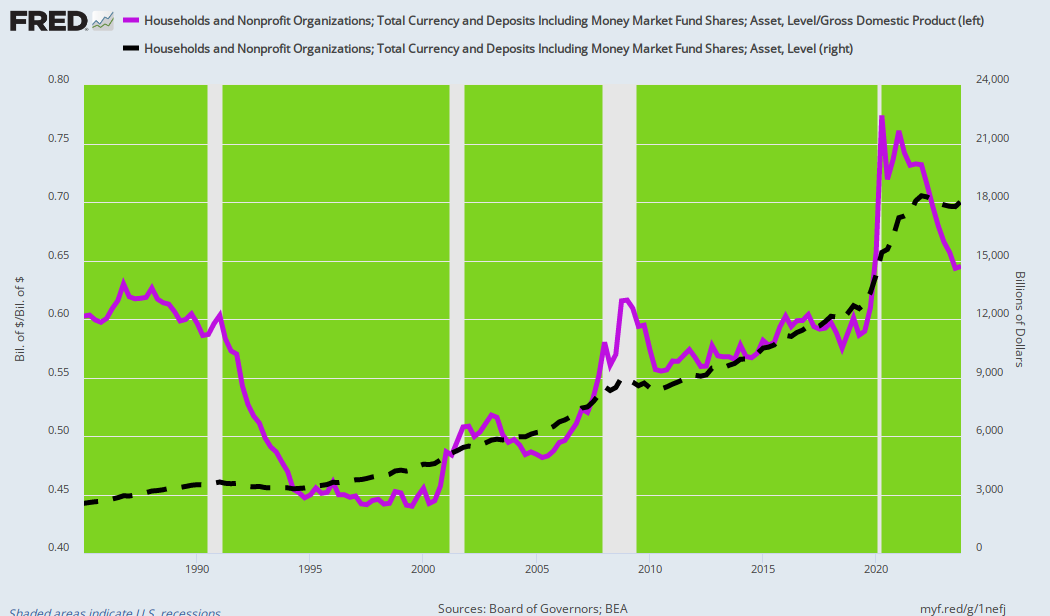
The story is evident in the purple line below, where the ratio of household cash balances to GDP stood at 60% back in 1985 and after some vicissitudes in the interim 35 years was still at 61% or $13.36 trillion on the eve of the pandemic in Q4 2019. Then Washington precipitously shut down the normal spending venues in the broad services sector of the US economy, thereby forcing households to save, while simultaneously injecting household bank accounts with a greater flood of free government cash than had been remotely imagined ever before, even in the biggest spending precincts inside the Washington beltway. At the peak in Q2 2020, the ratio of household cash to GDP hit 77.4%.
As it happened, several rounds of stimmies and lockdowns caused household cash balances to soar by nearly $5.0 trillion from the prepandemic level (Q4 2019) to $18.28 trillion by Q2 2022, or 71.5% of GDP. At that point, the implied excess compared to the normal 60% cash balance to GDP ratio was $2.93 trillion.
In the most recent quarters, however, household cash balances have slowly declined and have slipped to $18.03 trillion in Q4 2023, while nominal GDP has continued to expand. Consequently, the cash balance ratio has fallen to 64.5%. Still, the normal 60% ratio would have generated only $16.77 trillion of cash balances (currency, bank deposits, and money market funds) in Q4 2023, meaning that the excess cash was still $1.26 trillion above normal at the most recent reporting date.
That in itself is the true tale. To wit, fully $1.68 trillion or 56% of the Q2 2022 excess cash balance has already flowed into the spending stream. Stated differently, during the six quarters between Q2 2022 and Q4 2023, the excess cash balance runoff amounted to $280 billion per quarter, while nominal GDP rose by $2.4 trillion or $400 billion per quarter. Accordingly, the excess cash runoff accounted for nearly 70% of the average GDP gain during the post-Lockdown and stimmy-driven recovery.
Then again, that’s about all she wrote. At the current runoff rate of excess household cash, the historic 60% to GDP ratio will be reached by the end of 2024. At that point, the US economy will be freighted down with more than $100 trillion of combined public and private debt. And it will not be characterized as either strong or even resilient.
Nor is that the half of it. According to the Commerce Department, nominal GDP and real GDP grew at just 6.00% per annum and 2.76% per annum, respectively, between the stimmy peak of Q2 2022 and Q1 of 2024. However, even the latter modest real GDP gain was owing to the dubious presumption that during what was ground zero for the highest inflation in 40 years the GDP deflator rose by only 3.14% per annum.
Indeed, even the trimmed mean CPI increase over that period was posted at 4.44% per year. So we’d bet that real output gains amounted to 1.5% per annum at best during the last six quarters. And that more than two-thirds of that was accounted for by the runoff of excess household cash. In short, maybe the US economy has actually been growing at 0.5% per annum.
Friday’s Jobs Report for April provides further reinforcement. In fact, the 175,000 gain in the headline jobs number represented the action of an economy that is living on borrowed time per the above-described cash cushion, and made to look even healthier by the purely bogus topline of the BLS establishment survey.
As it happens, by the BLS’ own reckoning, total hours worked in the private sector during April declined by 0.2% from the March level. And that only accelerates at a long-running weakening trend that belies the strong labor market brouhaha emanating from the Wall Street permabulls.
When you look at the proper metric for labor utilization—hours worked rather than headline job counts which conflated 15 hour per week burger-flippers with 50 hour per week oilfield roughnecks—that de-acceleration is plain as day. The long-term trend rate has fallen by nearly two-thirds:
Growth Rate Of Aggregate Private Sector Labor Hours:
- January 1964 to September 2000: +2.00% per annum.
- September 2000 to April 2024: +0.74% per annum.
Needless to say, you have to systematically unpeel the BLS’ ludicrously contorted and goal-seeked headline jobs number to grasp this underlying reality. The Fed’s fanboys would have you believe, for instance, that between June 2023 and today’s April 2024 report about 2.26 million new jobs have been created in the US economy, which amounts to a seemingly healthy gain of 226,000 per month.
But that is from the so-called “establishment survey.” The latter is based on “mail-in” ballots from about 119,000 US businesses or about 2.0% of the nation’s 6.1 million total business units that have at least one paid employee. At the present time, however, the response rate to the BLS survey is barely 43% compared to 63% as recently as 2014. Moreover, there is no special reason to believe that the missing 68,000 responses are random or consistent with the mix of firms actually mailing in their results in prior months, quarters, and years.
That doesn’t slow down the green eyeshades at the BLS, of course. The numbers for all the missing respondents and the rest of the full business economy are trended in, guesstimated, imputed, modeled in, birth/death adjusted, seasonally manipulated, and otherwise puked up out of the BLS’ goal-seeked computers. And then on Jobs Friday once per month, trillions of dollars’ worth of capital markets securities’ value moves up or down instantly and often materially on their publication.
Never mind that everything below the BLS report’s headline jobs number warns of disconnects, inconsistencies, puzzles, contradictions, and unreliability. For instance, today’s companion “household “survey, which is based on 50,000 phone interviews, as opposed to mail-in reports, indicated a job gain of just 25,000.
While that doesn’t sound nearly as robust as the 175,000 establishment survey number, it’s actually not even half of it. If we go back to what appears to be an interim economic peak for this cycle, the household survey reported 161.004 million total employed workers in June 2023, with a figure posted at 161.491 million in April 2024. The implied gain is 487,000 “workers” compared to the 2,260,000 additional “jobs” reported in the establishment survey for the ten months ending in April.
So either each new “worker” in April was holding down 4.64 “jobs” or there is a skunk on the woodpile here somewhere. And in fact, the full-time versus part-time employee factor turns out to be a special kind of big when it comes to the stink on the numbers.
According to the BLS, here are the levels and the change between June 2023 and April 2024 for these two household survey categories:
- Full-Time Employees: 134.787 million versus 133,889 million for a loss of 898,000 full-time employees.
- Part-Time Employees: 26.248 million versus 27.718 million for a gain of 1.470 million part-time employees.
We’d say go figure or, better yet, throw a dart at the BLS report and go with the number it lands on—since nearly all of them are badly massaged and incessantly revised.
To be clear, our point here is not to give the BLS a C- for its desultory efforts at job counting. To the contrary, it’s to give the Federal Reserve an F for even presuming that it can fiddle America’s $28 trillion economy between full employment and inflation on a month-to-month and even day-to-day basis via massive open market operations on Wall Street.
The whole misguided effort at monetary central planning has been an abject failure in part because the US economy—integrally intertwined in the $105 trillion global economy—is too complex, fast-moving, opaque, and ultimately mysterious to be stage-managed by the 12 mere mortals who sit on the Fed’s Open Market Committee, and who on a daily basis command the movements of tens of trillions of securities and derivative financial instruments.
Back in the day, Hayek referred to this as the problem of socialist calculation, and it has not gone away simply because Gosplan-style socialism has been supplanted by central bank-based financial command and control.
Moreover, even if the information and calculation problem were somehow to be overcome by wiring the brains of every consumer, workers, business manager, entrepreneur, investor, saver, and speculator to a 10,000-acre farm of Cray Computers, the insuperable difficulties of the Fed’s self-assigned mission of plenary economic control would not be remotely overcome. That’s because rate cuts and interest rate suppression long ago lost their potency in an economy now saddled with $98 trillion of public and private debt.
In any event, the proof is actually in the pudding from April’s jobs report. As detailed above, between 1964 and the dotcom peak in 2000—and at a time before money-printing really went off the deep end—the BLS’ reasonably serviceable metric for total hours worked in the private economy had grown by about 2.0% per annum. Add another 2.0% per year for productivity improvement due to robust investment, technology progress, and the equipping of workers with more and better tools and production processes, and you had a 4% growth economy.
Obviously, no more. The Fed’s massive inflation of financial assets has caused a drastic diversion of capital into speculation on Wall Street rather than productive investment on Main Street. So productivity growth has faltered badly to just 1.25% per annum since 2010.
At the same time, the inflation-saturated US economy has lost much of its industrial base to lower-cost venues abroad. Consequently, since the pre-dotcom peak in 2000, the growth rate of private sector labor hours employed has plunged to the aforementioned 0.74% per annum. Thus, the ingredients of economic growth added together now amount to just 2.0% or half the historic rate.
At the end of the day, there is no doubt about it. Both productivity growth and labor growth have been systematically undermined and diminished by the kind of Keynesian monetary central planning currently pursued by the Federal Reserve. And the current inching toward a new round of destructive money-printing is just further proof of that truism.
Nevertheless, the failure of monetary central planning has not diminished the harm being imposed on Main Street America by Fed policies. For instance, during the most recent month (January) US home prices were up by 6.0% on a Y/Y basis and were therefore just one more reminder of why the Fed’s pro-inflation policies are so insidious. In essence, they set up a running battle between asset prices and wages, and the former wins hands down.
For avoidance of doubt, here is the long view on the matter, with home prices indexed in purple and average wages in black.
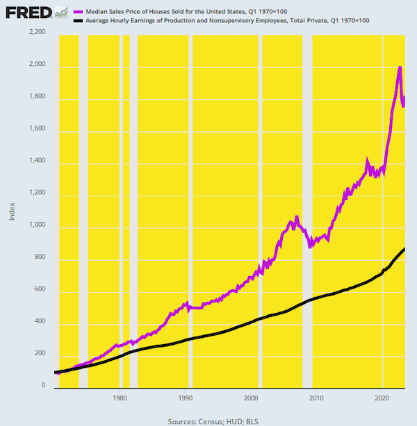
We have indexed the median sales price of homes in America and the average hourly wage to their values as of Q1 1970. That was the eve of Nixon’s plunge into pure fiat money at Camp David in August 1971 and all the resulting monetary excesses and metastases since then.
We have indexed the median sales price of homes in America and the average hourly wage to their values as of Q1 1970. That was the eve of Nixon’s plunge into pure fiat money at Camp David in August 1971 and all the resulting monetary excesses and metastases since then.
The data leaves no room for doubt. Home prices today stand at 18.2X their Q1 1970 value while average hourly wages are at only 8.7X their value of 54 years ago.
Expressed in more practical terms, the median home sales price of $23,900 in Q1 1970 represented 7,113 hours of work at the average hourly wage. Assuming a standard 2,000-hour work year, wage workers had to toil for 3.6 years to pay for a median-priced home.
With the passage of time, of course, the Fed’s pro-inflation policies have done far more to goose asset prices than wages. Thus, at the time of Greenspan’s arrival at the Fed after Q2 1987, it required 11,350 hours to purchase a median home, which had risen to 12,138 hours by Q1 2012 when the Fed made its 2.00% inflation target official. And after still another decade of inflationary monetary policy, it now stands at just under 15,000 hours.
In a word, today’s median home price of $435,400 requires 7.5 standard work years at the average hourly wage to purchase, meaning that workers now toil well more than twice as long as they did in 1970 to afford the dream of home ownership.
So the question recurs. Why in the world would our esteemed central bankers wish to impoverish America’s workers by doubling the working hours needed to buy a median priced home? And, yes, the above assault on the middle class is a monetary phenomenon. It was not caused by home builders monopolizing the price of new houses nor by shortages of land, lumber, paint, or construction labor over that half-century period.
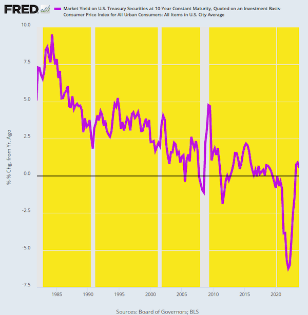
To the contrary, when the Fed inflates the monetary system, the resulting ill effects work through the financial markets and real economy unevenly. Prices, including those for labor and assets, do not move in lockstep, because foreign competition holds down some prices and wages while falling real interest rates and higher valuation multiples inherently cause asset prices to rise disproportionately.
Thus, the reference rate for all asset prices — the 10-year US Treasury note (UST) — fell drastically in real terms during the last four decades of that period. Real rates at 5%+ during the 1980s fell to the 2–5% range during the Greenspan era, and then plunged further, to zero or below, owing to the even more egregious money-printing policies of his successors.
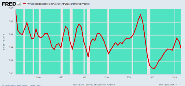
The stated purpose of the easy-money trend depicted above, of course, was to spur more investment in housing, among other sectors. But that didn’t happen. The residential housing investment-to-GDP ratio dropped from the historical 5–6% zone prior in 1965 to an average of 4.5% during the period of the Greenspan housing bubble peak in 2005. After the housing crash during the Great Financial Crisis it barely posted at 3% of GDP before rebounding irregularly to 3.9% in 2023.
Any way you slice it, however, the aggressive monetary expansion after 1987 did not spur incremental housing investment on any sustainable basis. Instead, it led to debt-fueled speculation in the existing housing stock, sending prices rising far faster and far higher than the growth of household income and wages.
An alternative measure of the impact of easy money on housing investment can be seen in the index of housing completions relative to the US population. Since the early 1970s, that ratio has been trending steadily downward and now stands at only 45% of its 50-years-ago value.
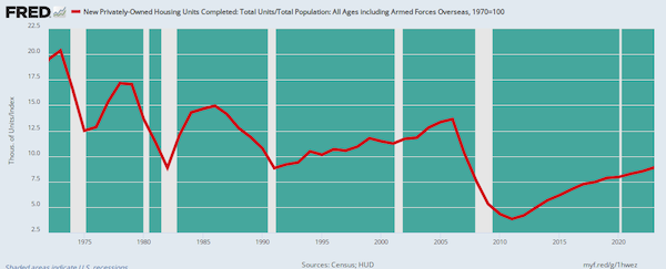
Needless to say, if cheap mortgage credit were the elixir it is claimed to be, the line in the chart would have trended skyward. As it happened, however, it is a stinging repudiation of the very essence of the case for low interest rates so relentlessly promoted by Wall Street and Washington alike.
At the end of the day, the US economy is not remotely “strong,” as the talking heads blathered about again last Friday. Likewise, the BLS report is once again hardly worth the digital ink it is printed upon.
So, a central bank policy based on a monetary politburo fiddling the nation’s massive $28 trillion economy toward undefinable and immeasurable full employment and 2.00% inflation can be described in only one way. To wit, a trainwreck in full flight.
Reprinted from David Stockman’s private service
Disclaimer
Some of the posts we share are controversial and we do not necessarily agree with them in the whole extend. Sometimes we agree with the content or part of it but we do not agree with the narration or language. Nevertheless we find them somehow interesting, valuable and/or informative or we share them, because we strongly believe in freedom of speech, free press and journalism. We strongly encourage you to have a critical approach to all the content, do your own research and analysis to build your own opinion.
We would be glad to have your feedback.

Source: Brownstone Institute Read the original article here: https://brownstone.org/